
Bill 5 front
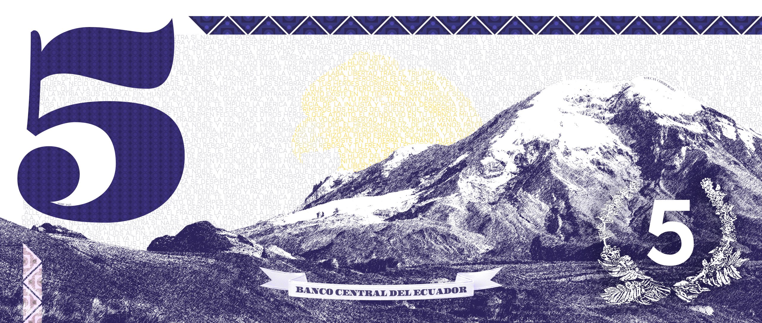
Bill 5 back
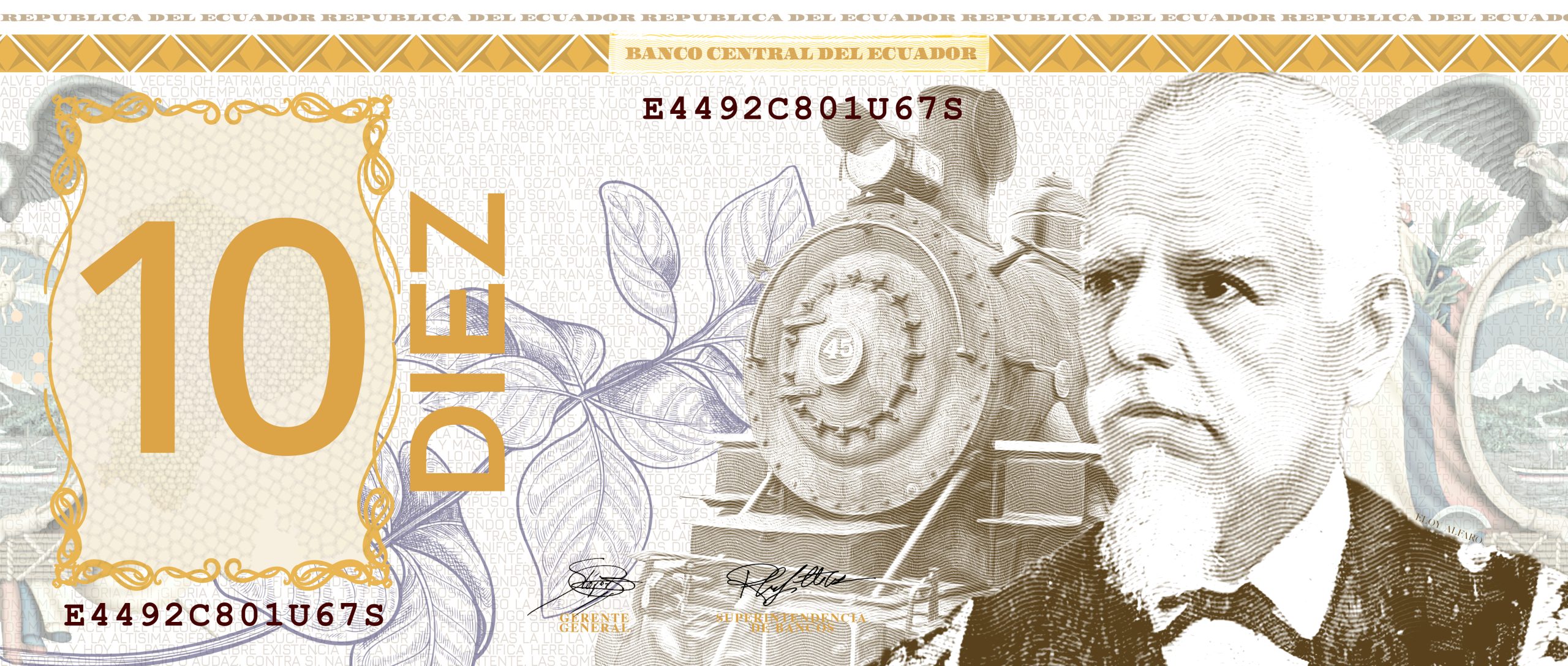
Bill 10 front
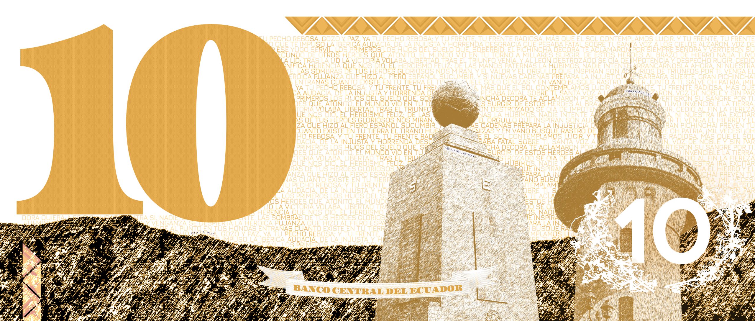
Bill 10 back
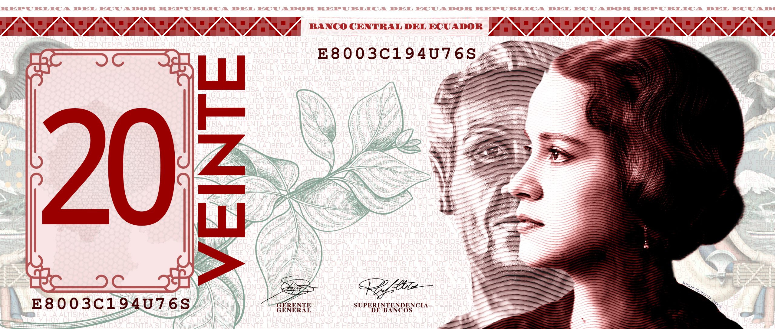
Bill 20 front
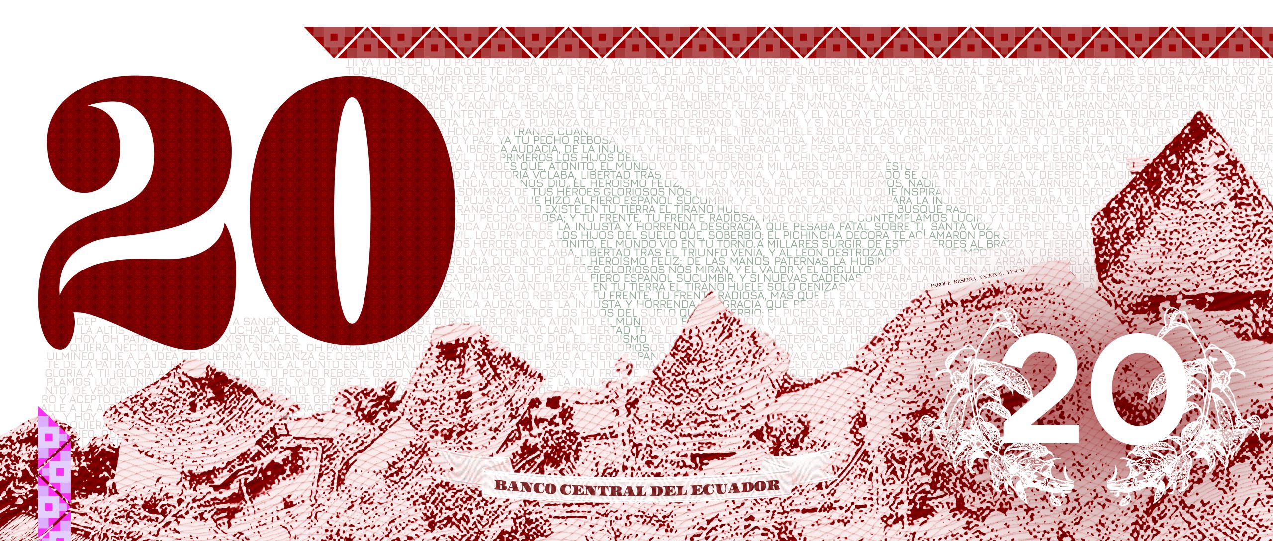
Bill 20 back
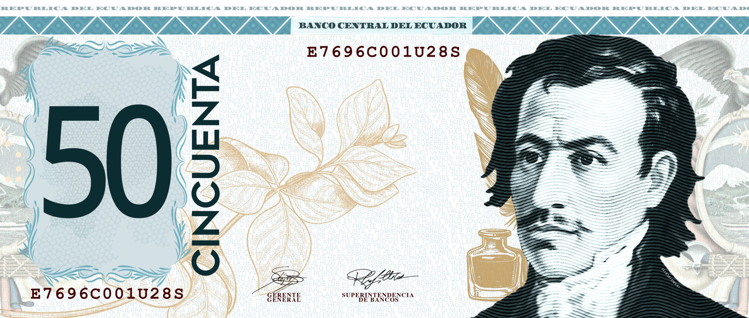
Bill 50 front
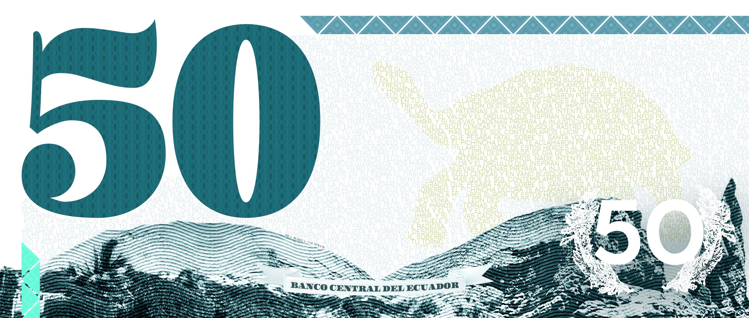
Bill 50 back
Concept
This project is a creative redesign of Ecuador’s paper currency. While the country continues to use the U.S. dollar, this concept imagines what it would look like if the bills reflected Ecuador’s own culture, history, and identity — much like the old Sucre bills did before the dollar was adopted. The goal is to bring back a sense of national pride and visual connection through the money people use every day, without changing the currency itself.
Colour Palette
The color palette for the redesigned bills draws inspiration from the original Sucre banknotes, bringing back some of their richness and personality. At the same time, the design keeps a more minimal and monochromatic approach, similar to the simplicity of U.S. dollar bills. The main colors are based on the Ecuadorian flag — yellow, blue, and red — paired with complementary tones to create balance, contrast, and a sense of national identity within a clean, modern layout.
Patterns
Adean patterns from indigenous communities are represented in each bill.

Typefaces
For the typography, I used Geometos to give the bills a clean, modern feel with clear, easy-to-read numbers. To tie the design back to the original U.S. dollar aesthetic, I also incorporated the Assets typeface, which closely resembles the custom serif font used on American currency, adding a touch of familiarity and tradition to the layout. Courier New was added to replicate the look of the serial numbers
